Acorn Rebrand

Acorn Rebrand
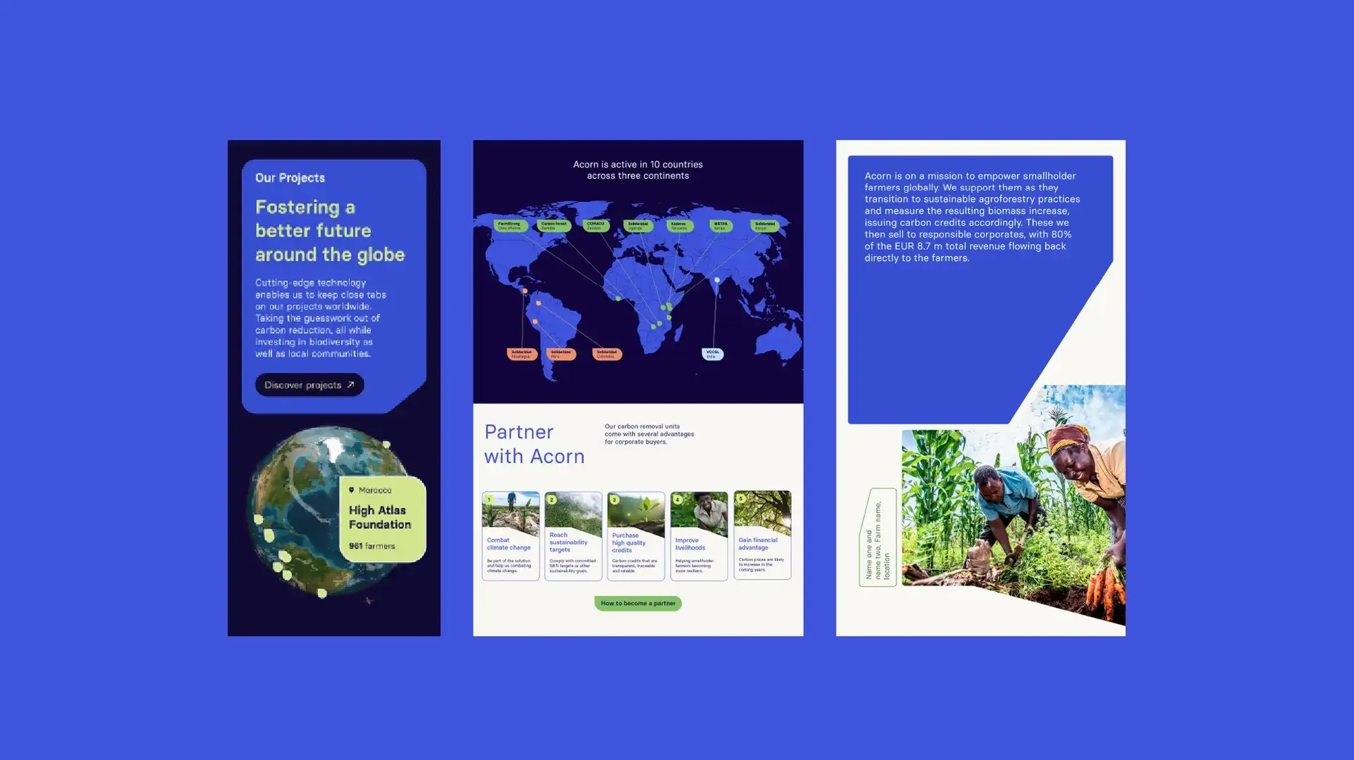
Acorn is on a mission to empower smallholder farmers globally. They support them as they transition to sustainable agroforestry practices and measure the resulting biomass increase, issuing carbon credits accordingly which are then sold to responsible corporates.
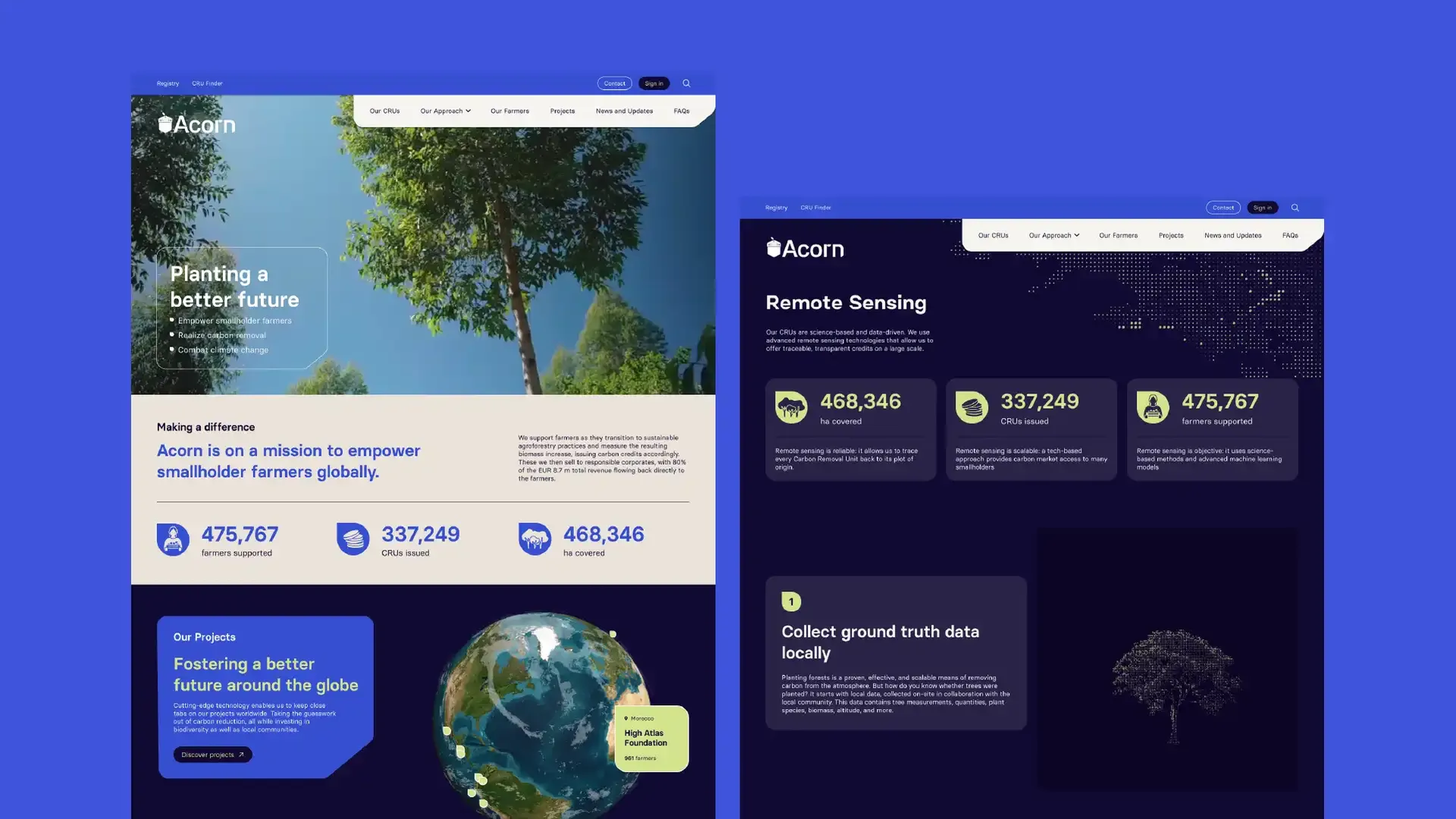
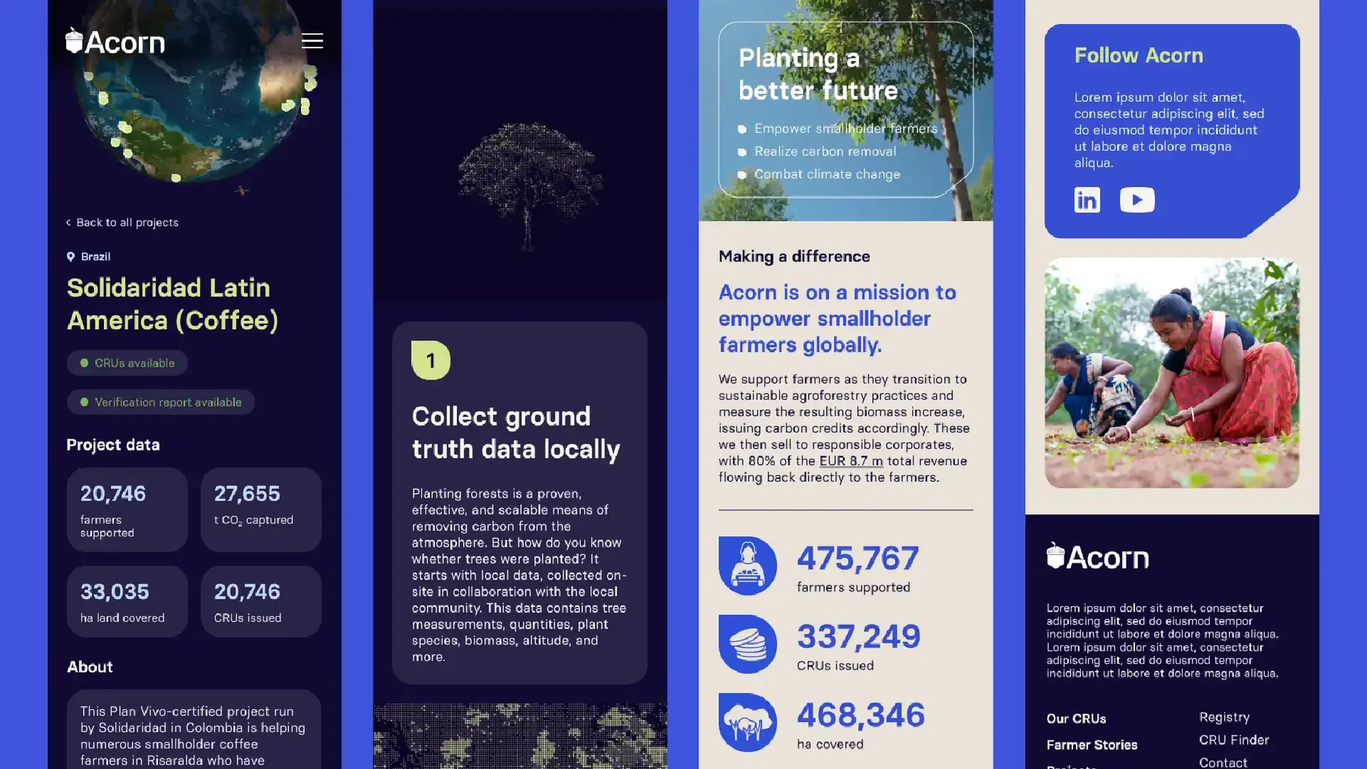
Acorn, a household name in the voluntary carbon market, needed an updated visual identity to support their mission and refocus design elements to target professional stakeholders: buyers, local partners, certifiers. The brand needed to communicate their cause and mission to empower smallholder farmers through nature based solutions, while also communicating their position as credible leader in the voluntary carbon market.
CREATIVE APPROACH
A balancing act between giving the brand a sense of familiarity and groundedness, and communicating their technology focused solutions and future forward approach was achieved through the colour palette selection and the graphic language. The brand needed to communicate transparency and credibility in what can be a somewhat murky industry.
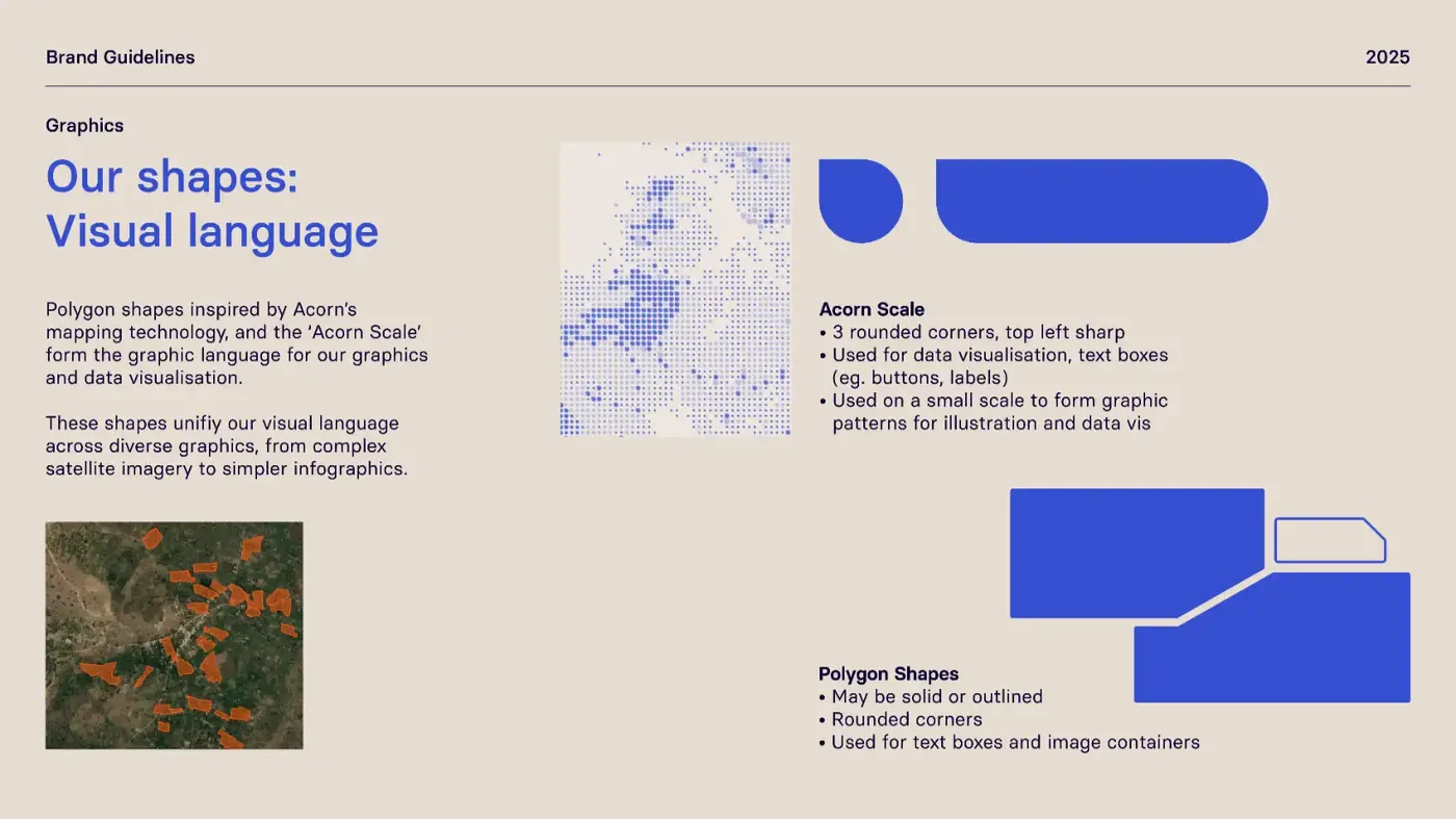
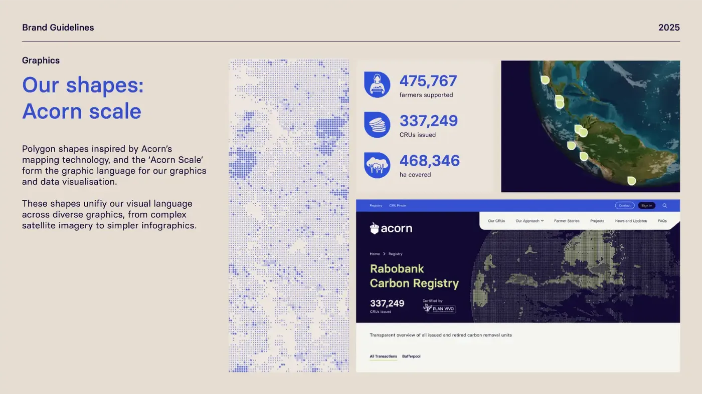
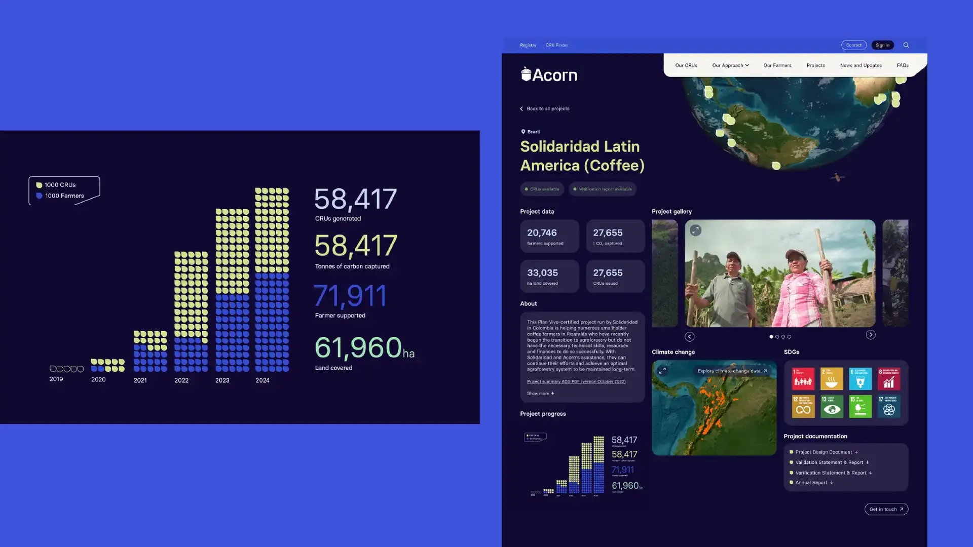
Polygon shapes inspired by Acorn’s mapping technology, and the ‘Acorn Scale’ form the graphic language for graphics and data visualisation.
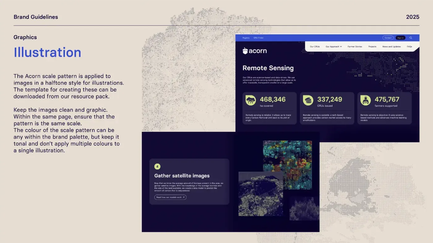
These shapes unify the visual language across diverse graphics, from complex satellite imagery to simpler infographics.